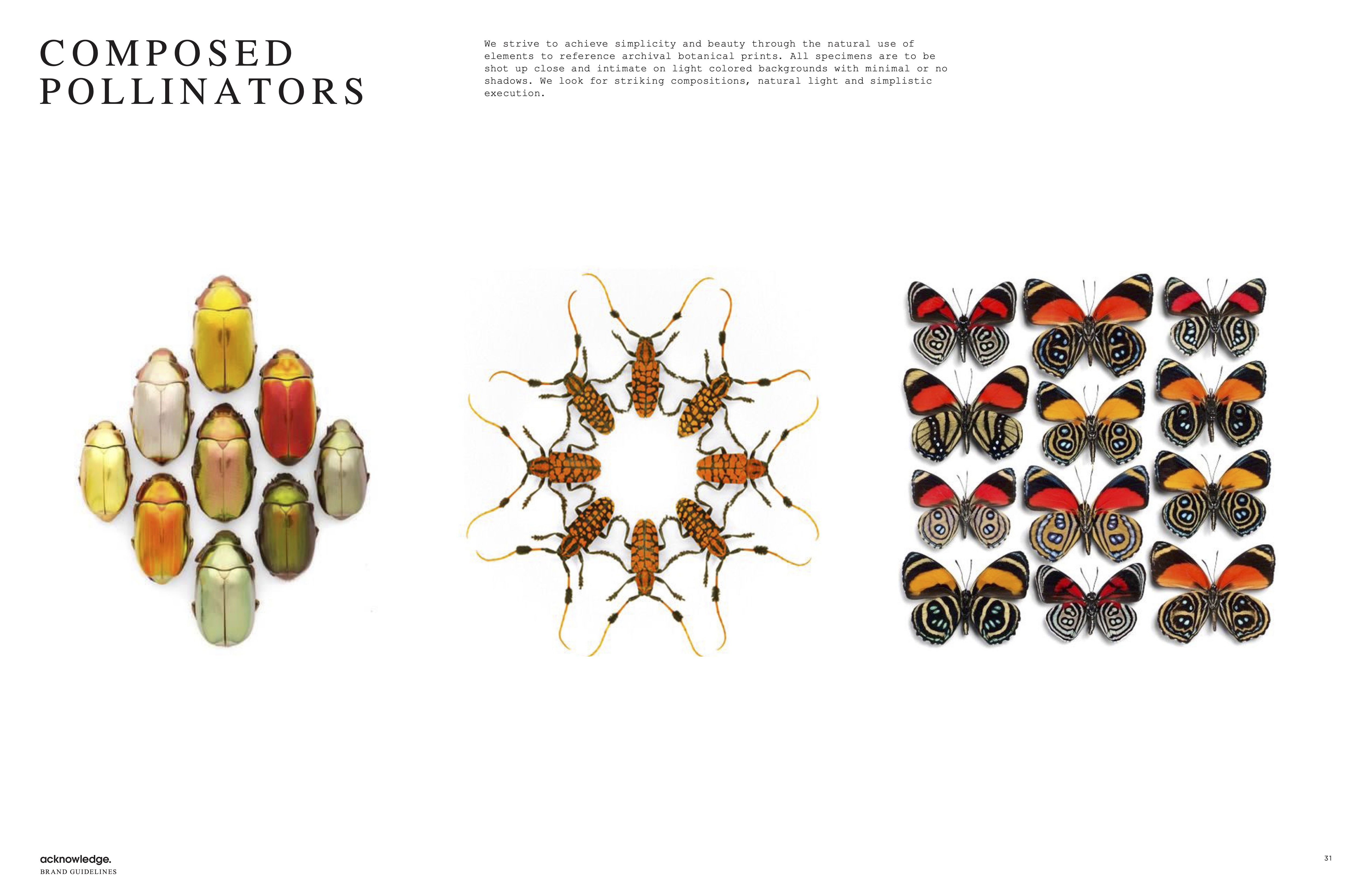
(Case 0
8
)
2022
Axelera
Axelera

Branding + Marketing
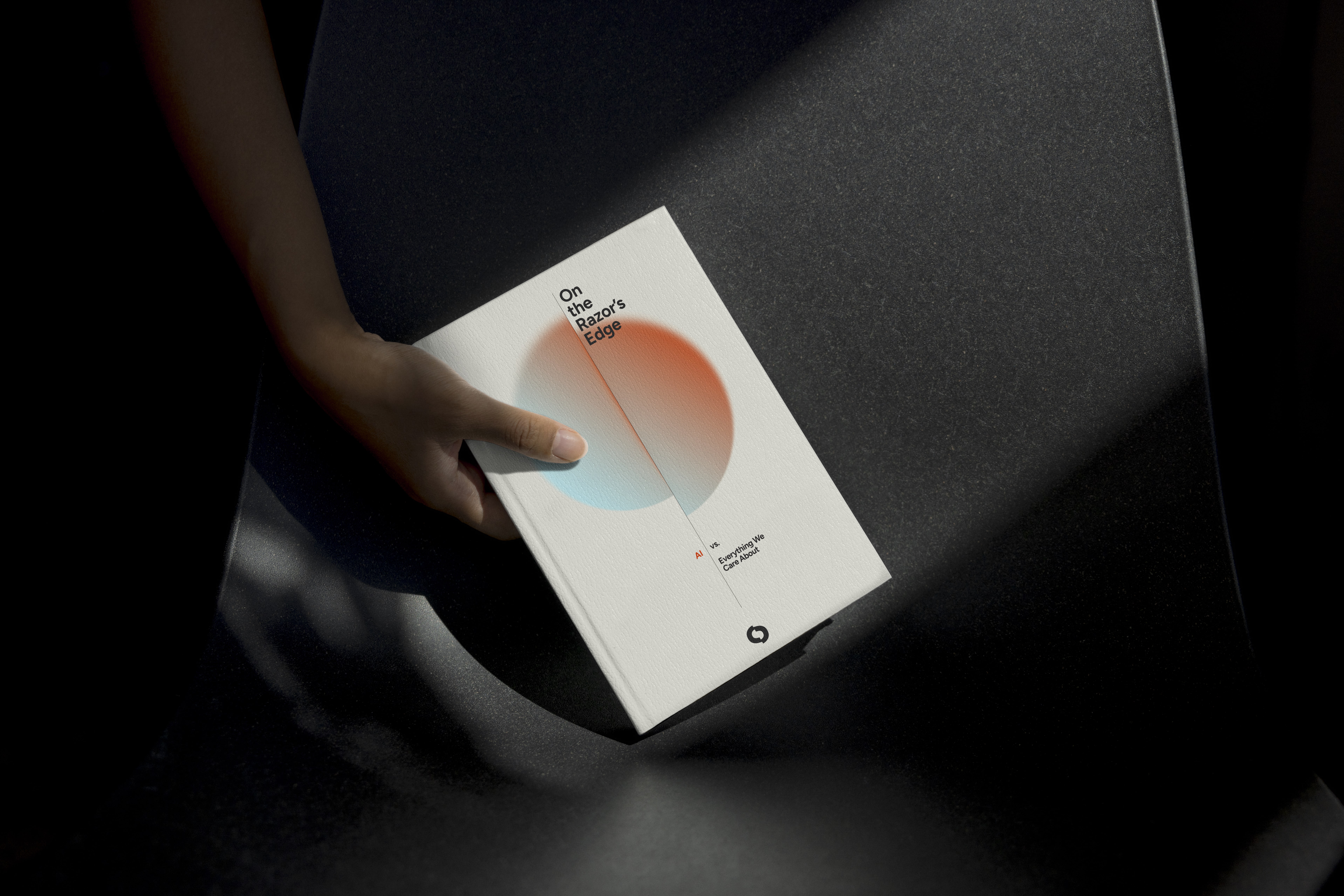
Case Study
Axelera
About the case
Axelera is an AI-powered semiconductor company accelerating the future of intelligent computing. We designed a brand identity that feels like pure velocity—powerful, sleek, and unapologetically futuristic. Inspired by the silent force of machines thinking at the speed of light, the visual language evokes motion and possibility, reflecting Axelera’s vision to shape a new era where hardware and intelligence move as one.

Photography had to be grounded in a sense of agency, not pulled by the gravitational weight of an unknown future, but subjects were centered by their confidence, even in the unknown. There is optimism and a touch of whimsy conveyed through color and tonal vibrancy.
We invited images that explore luminosity, shadow, light motion, refraction, lens flare, light leaks, and the depth and layering of an image.
image curation


Graphic Illustration
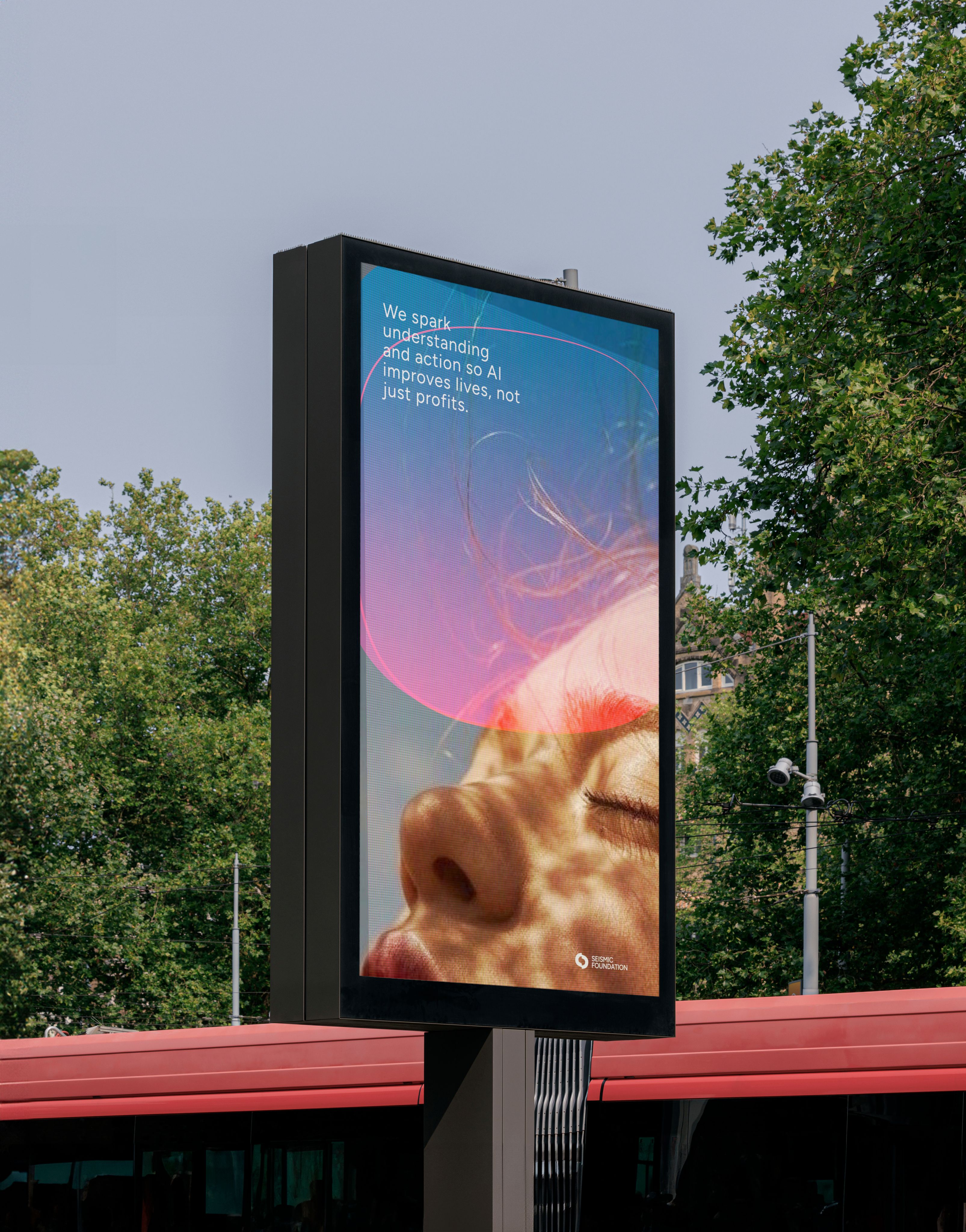
The graphic system draws on natural phenomena and structural flows. The same systems that reveal when something under the surface is moving or shifting. These visuals echo the tension inherent in emerging AI technologies: potential and uncertainty, disruption and protection.
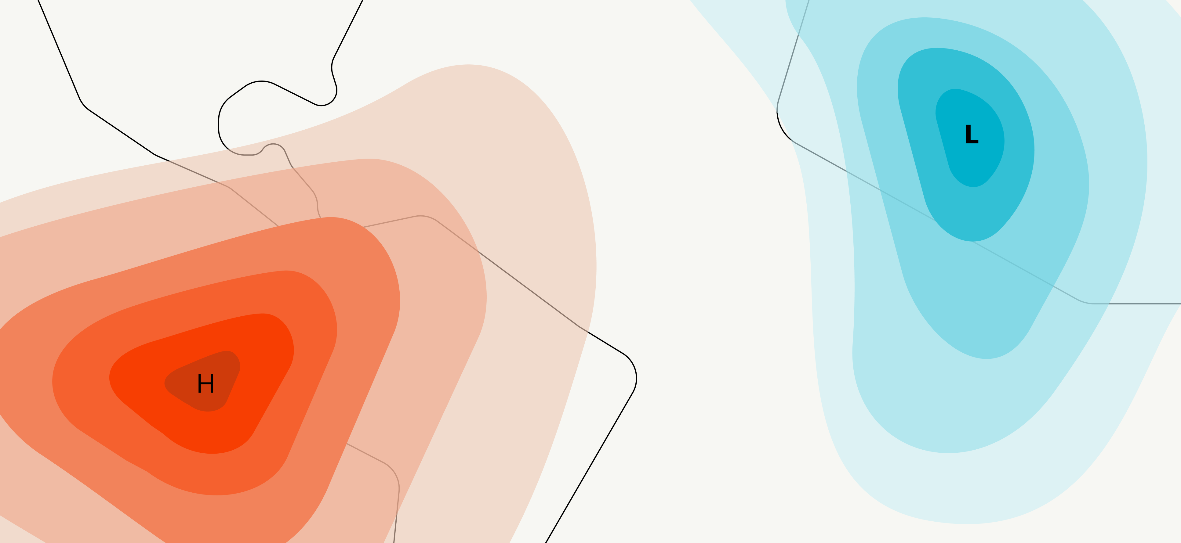
It’s designed to reflect the big picture — the unpredictable nature of change, the fragile balance between power and vulnerability, the collective responsibility we carry in shaping a human-centered future of AI.

Through that lens, every line, shape, and color feels like part of a larger conversation: one about awareness, safety, humanity, and possibility.
The end result is a graphic illustrative system that supports Seismic not just as an organization issuing reports but as a movement advocating informed public engagement, responsible adoption, and proactive guardianship of human integrity in an AI-transformed world.

These forms were then woven into the design system across social graphics, banners, and advertising. They serve as subtle cues to the brand and its mission, adding a sense of luminosity and optimism about human agency in an uncertain future.


Axelera
Axelera came to us as they prepared for their Series A, ready to evolve beyond a successful Seed stage into a brand as bold and refined as their technology. They sought an identity that radiates power and precision—sleek, streamlined, and effortlessly efficient. Working closely with the CEO, we honed the brand story, distilled its core essence, and brought it to life through a palette of rich color and dynamic texture.


Blending the raw edge of technology with subtle organic textures, the system reflects the seamless integration of hardware and software at the heart of their AI. The voice is sharp and direct—no frills, no overreach. Built for a B2B audience, it speaks the native language of AI with clarity and confidence, letting the technology lead the conversation.