(Case 0
9
)
2022
Infinity
Infinity

Branding + Experiential
Case Study
Infinity
About the case
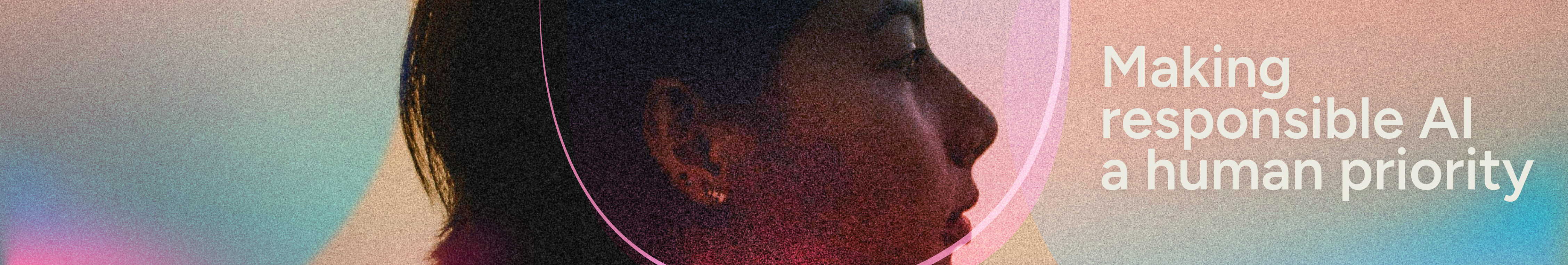
Quantum Delta NL’s Infinity initiative is a bold leap forward—uniting Europe’s quantum startups and transforming the Netherlands into the most fertile ground for innovation. Project Infinity is building a new kind of ecosystem—sustainable, collaborative, and limitless. As quantum computing nears, we prepare to break orbit, exploring new dimensions powered by a new paradigm of conscious capital.

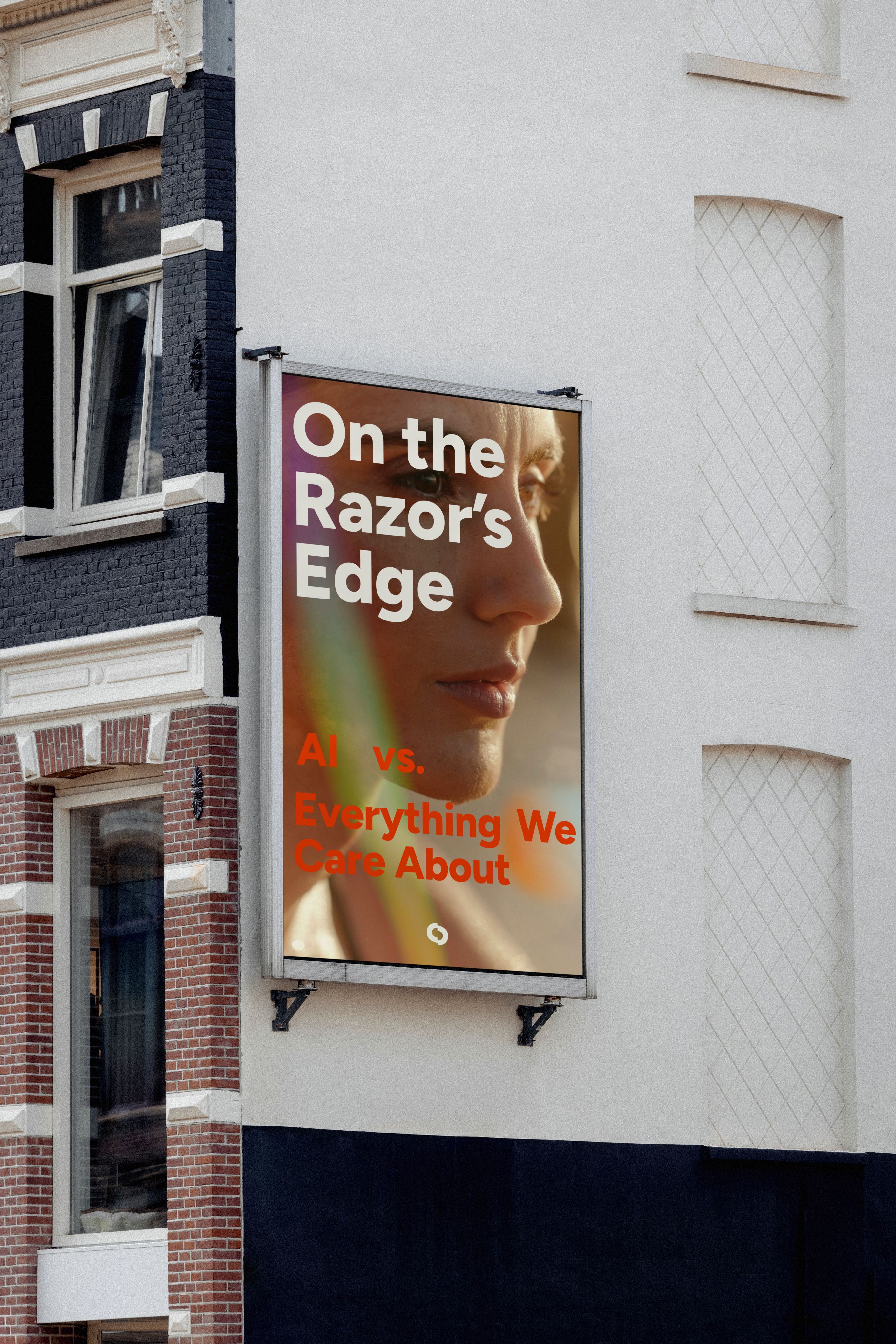
Photography had to be grounded in a sense of agency, not pulled by the gravitational weight of an unknown future, but subjects were centered by their confidence, even in the unknown. There is optimism and a touch of whimsy conveyed through color and tonal vibrancy.
We invited images that explore luminosity, shadow, light motion, refraction, lens flare, light leaks, and the depth and layering of an image.
image curation


Graphic Illustration
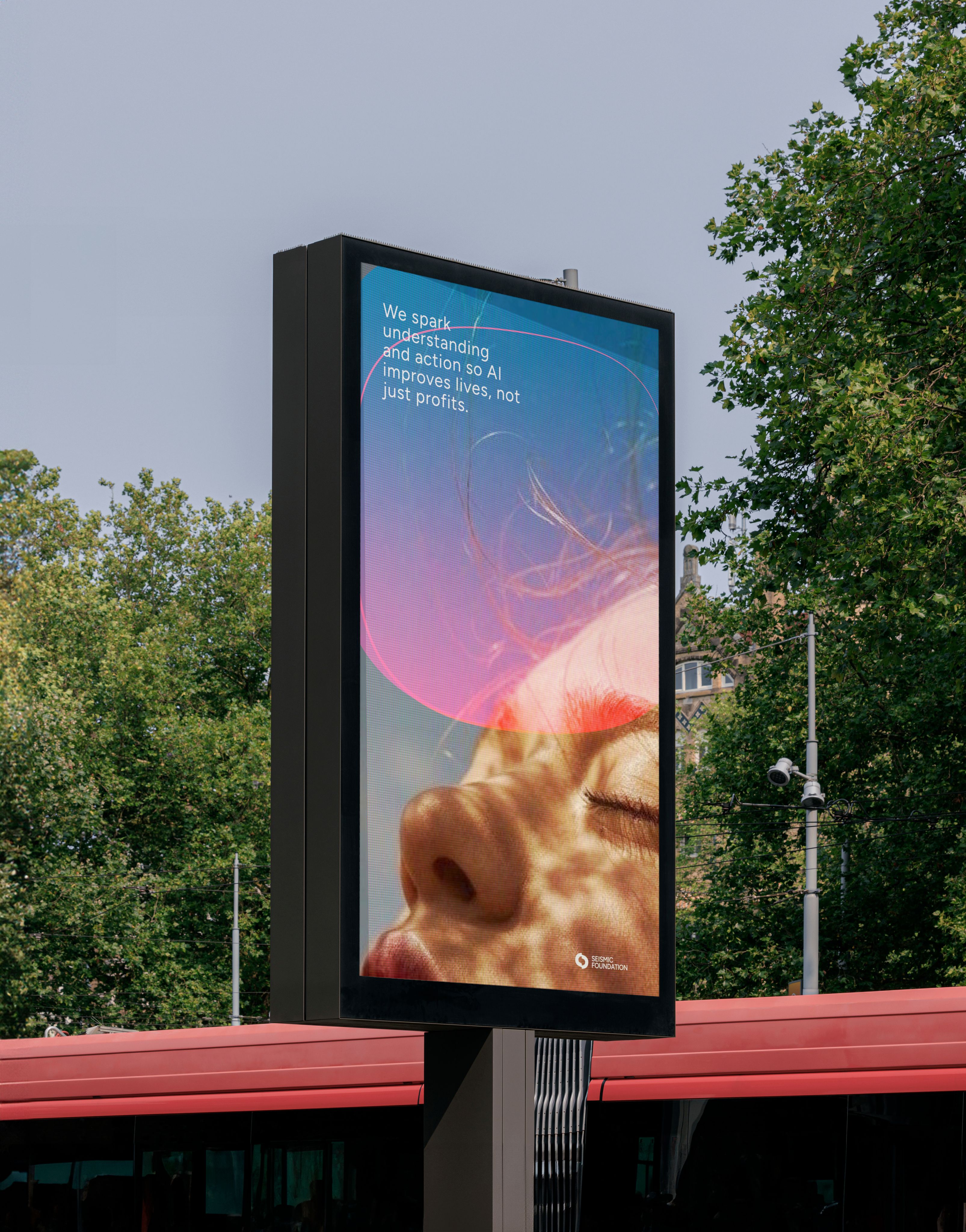
The graphic system draws on natural phenomena and structural flows. The same systems that reveal when something under the surface is moving or shifting. These visuals echo the tension inherent in emerging AI technologies: potential and uncertainty, disruption and protection.
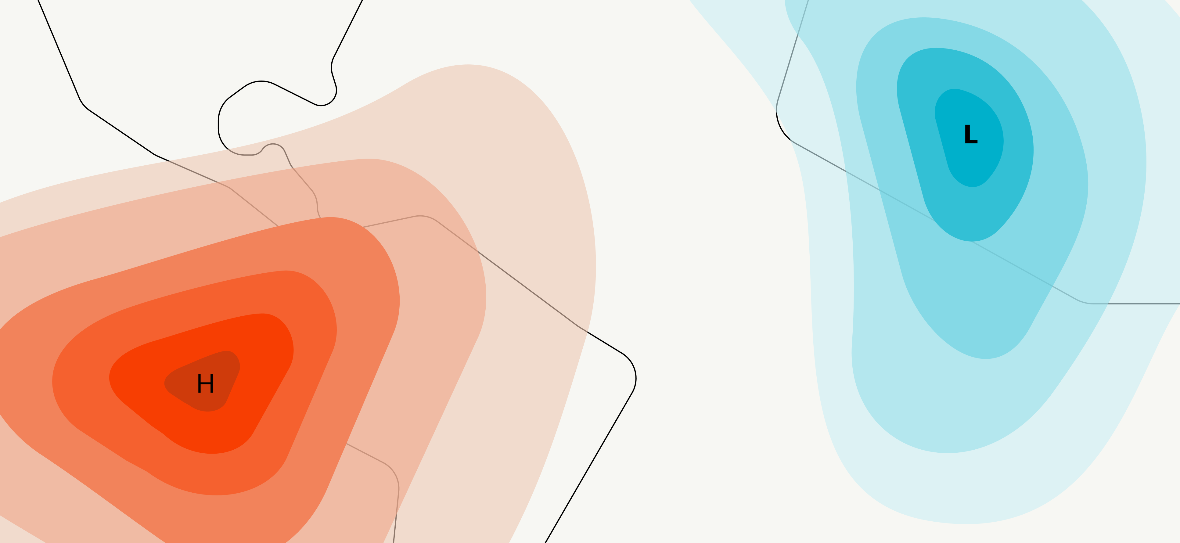
It’s designed to reflect the big picture — the unpredictable nature of change, the fragile balance between power and vulnerability, the collective responsibility we carry in shaping a human-centered future of AI.

Through that lens, every line, shape, and color feels like part of a larger conversation: one about awareness, safety, humanity, and possibility.
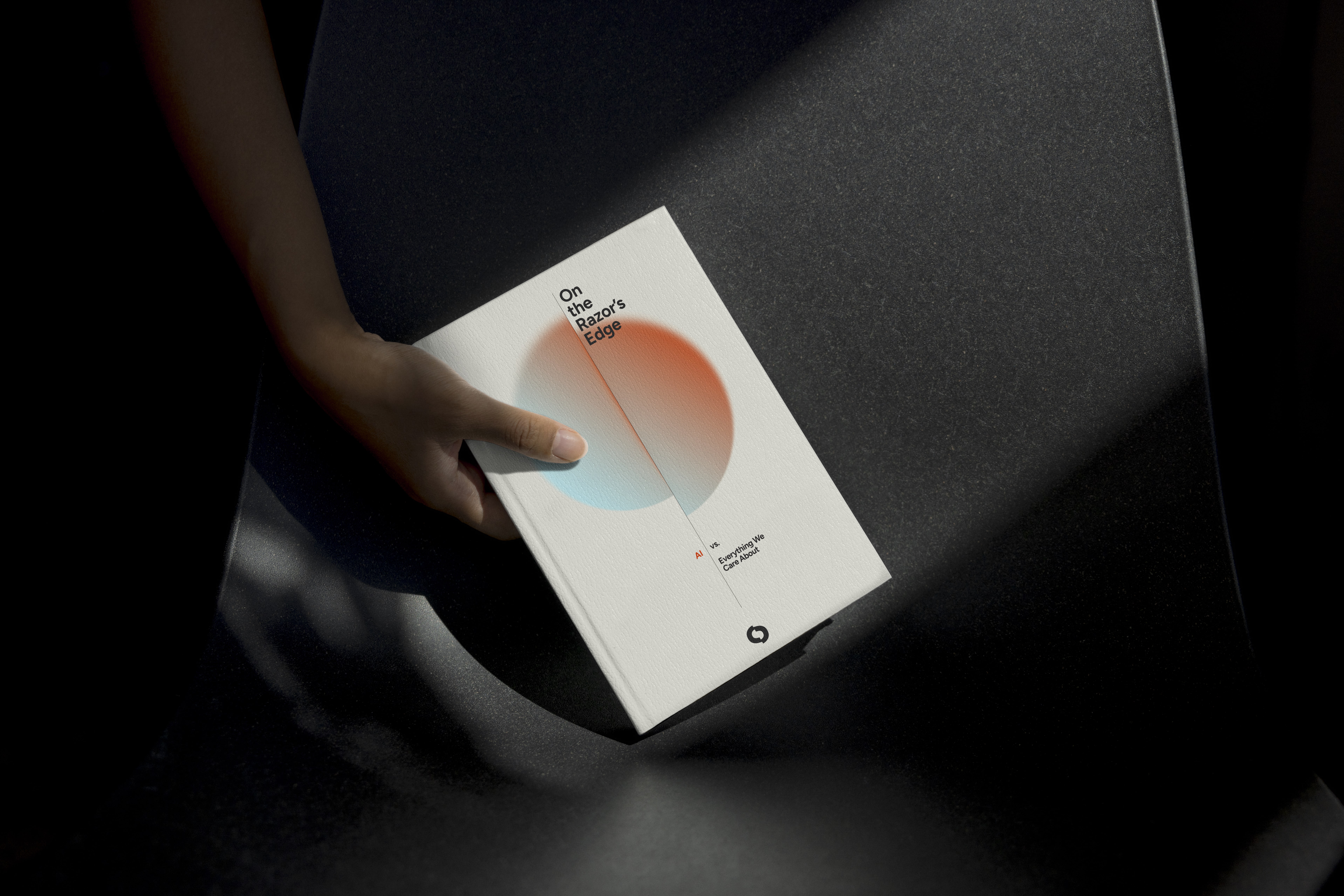
The end result is a graphic illustrative system that supports Seismic not just as an organization issuing reports but as a movement advocating informed public engagement, responsible adoption, and proactive guardianship of human integrity in an AI-transformed world.
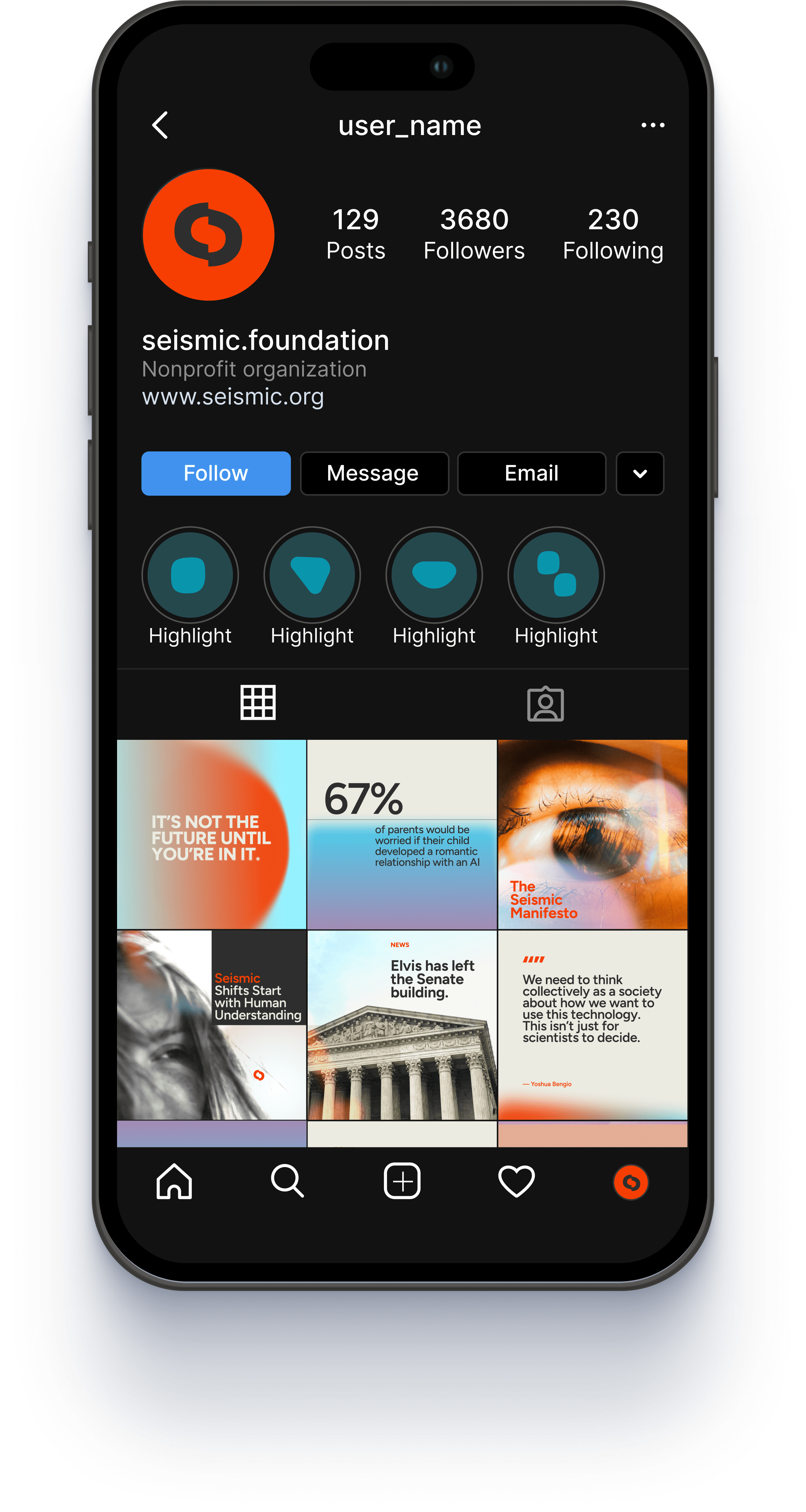
These forms were then woven into the design system across social graphics, banners, and advertising. They serve as subtle cues to the brand and its mission, adding a sense of luminosity and optimism about human agency in an uncertain future.


Infinity
We designed a custom logomark and type lockup to embody Infinity’s fluid, continuous philosophy. Simple and geometric, the mark uses layered circles to suggest growth and momentum—echoing the infinite without relying on the familiar symbol. With colors drawn from the Quantum Delta NL palette and a subtle retro twist, the design feels expansive and mysterious—a nod to the vast unknowns that quantum physics dares to explore. Built for versatility, the identity moves seamlessly across print and digital, grounded in clarity and motion.


The team at Infinity wanted visuals that broke free from the traditional, linear investment journey—favoring something more dynamic, cyclical, and adaptive. Unlike a simple loop or circle, their process shifts and diverges based on each startup’s unique challenges, accelerating them through tailored rounds of funding. To reflect this, we explored stacked shapes and orbital, space-inspired interpretations of infinity—each abstract form representing a different layer of support. The result is a sleek, dark-themed presentation that feels like stepping into the cockpit of a spacecraft—designed to guide the viewer through Infinity’s universe of possibility. (Most assets remain confidential, inquire for more information)