(Case 0

4

)

2024

Raven Crest Botanicals

Raven Crest Botanicals

Branding + Ecomm Optimization

Case Study

Raven Crest Botanicals

About the case

Raven Crest Botanicals is a sanctuary of plant wisdom—a place where herbal alchemy meets deep, ancestral knowing. To honor its essence, we reimagined the brand’s digital presence, weaving together a website that feels lush and intentional.

See the report

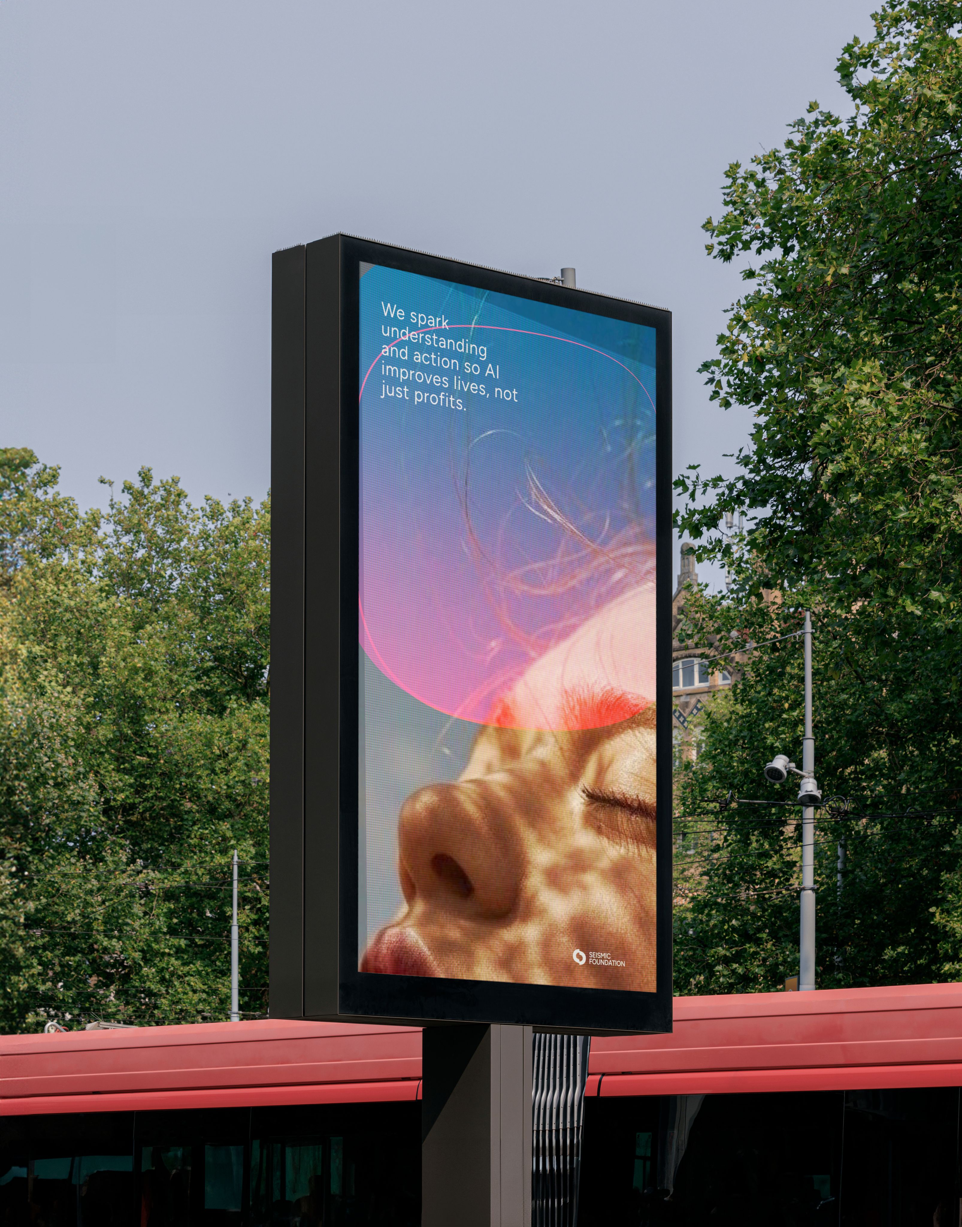
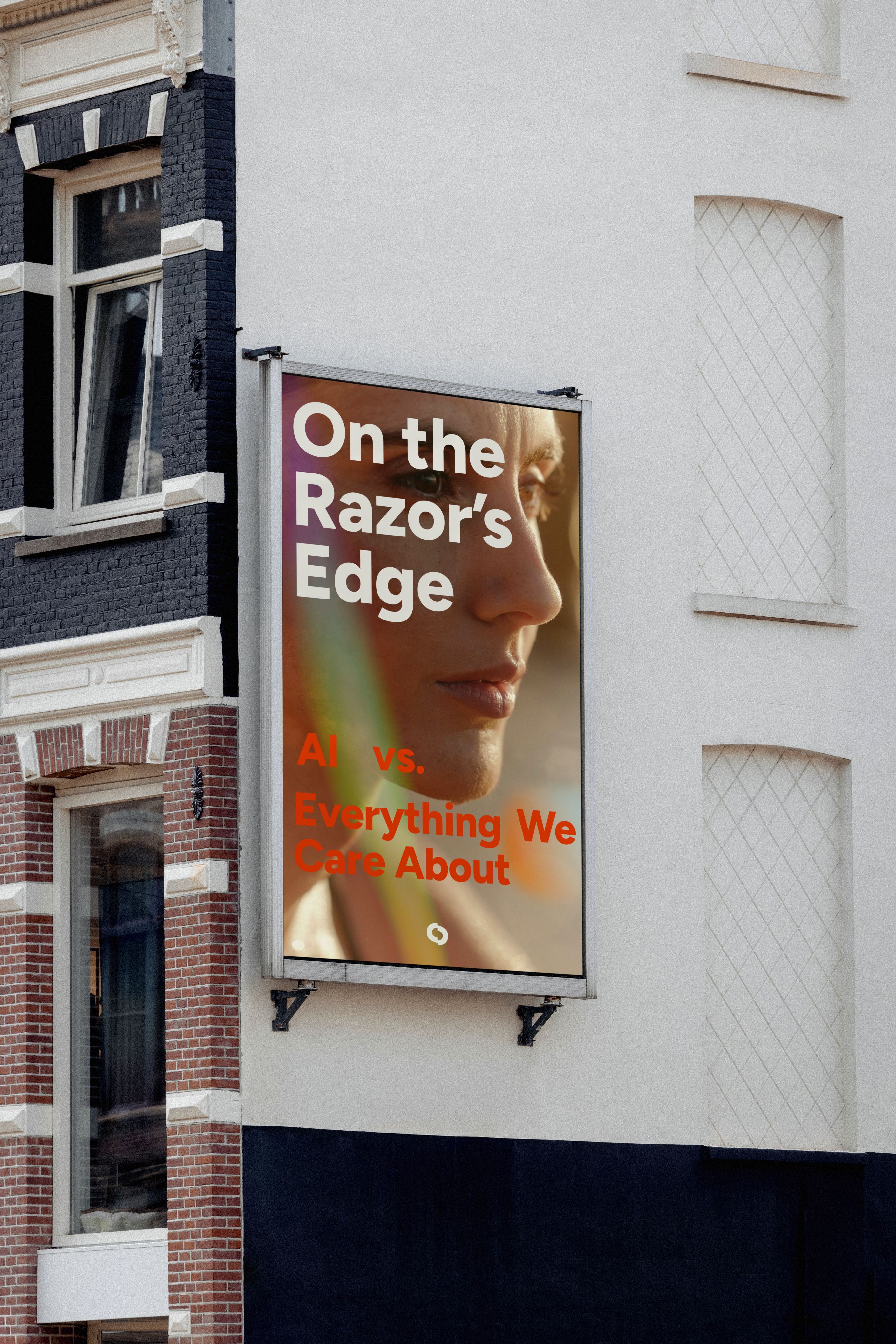
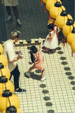
Photography had to be grounded in a sense of agency, not pulled by the gravitational weight of an unknown future, but subjects were centered by their confidence, even in the unknown. There is optimism and a touch of whimsy conveyed through color and tonal vibrancy.

We invited images that explore luminosity, shadow, light motion, refraction, lens flare, light leaks, and the depth and layering of an image.

image curation

Graphic Illustration

The graphic system draws on natural phenomena and structural flows. The same systems that reveal when something under the surface is moving or shifting. These visuals echo the tension inherent in emerging AI technologies: potential and uncertainty, disruption and protection.


It’s designed to reflect the big picture — the unpredictable nature of change, the fragile balance between power and vulnerability, the collective responsibility we carry in shaping a human-centered future of AI.


Through that lens, every line, shape, and color feels like part of a larger conversation: one about awareness, safety, humanity, and possibility.

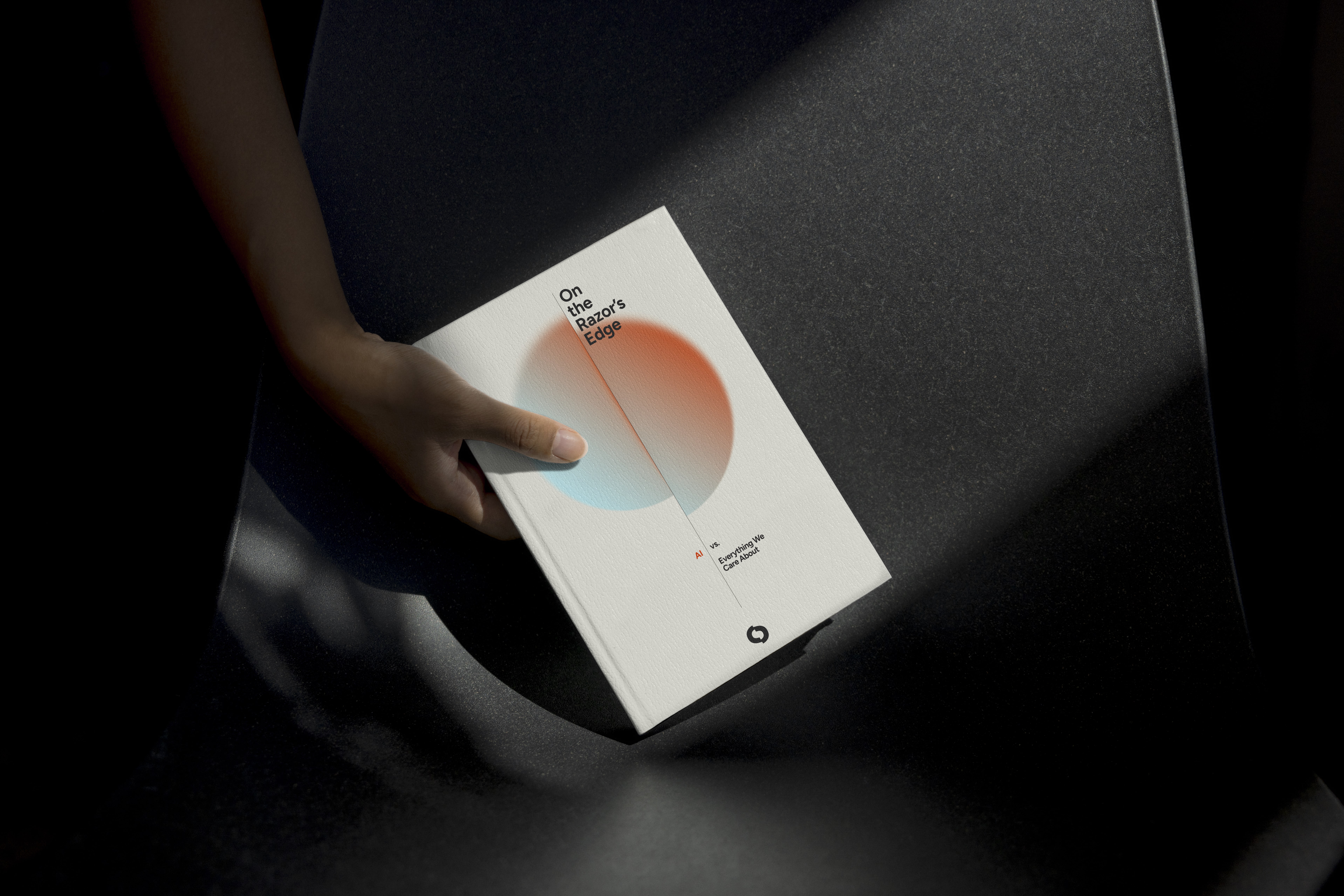
The end result is a graphic illustrative system that supports Seismic not just as an organization issuing reports but as a movement advocating informed public engagement, responsible adoption, and proactive guardianship of human integrity in an AI-transformed world.


These forms were then woven into the design system across social graphics, banners, and advertising. They serve as subtle cues to the brand and its mission, adding a sense of luminosity and optimism about human agency in an uncertain future.

Raven Crest Botanicals

We transformed a standard Shopify template into a fully customized plant haven. Every element was designed to create a sensory-rich experience where the products and plants take center stage. Intuitive navigation and user flow ensures a smooth, inviting journey from discovery to checkout.

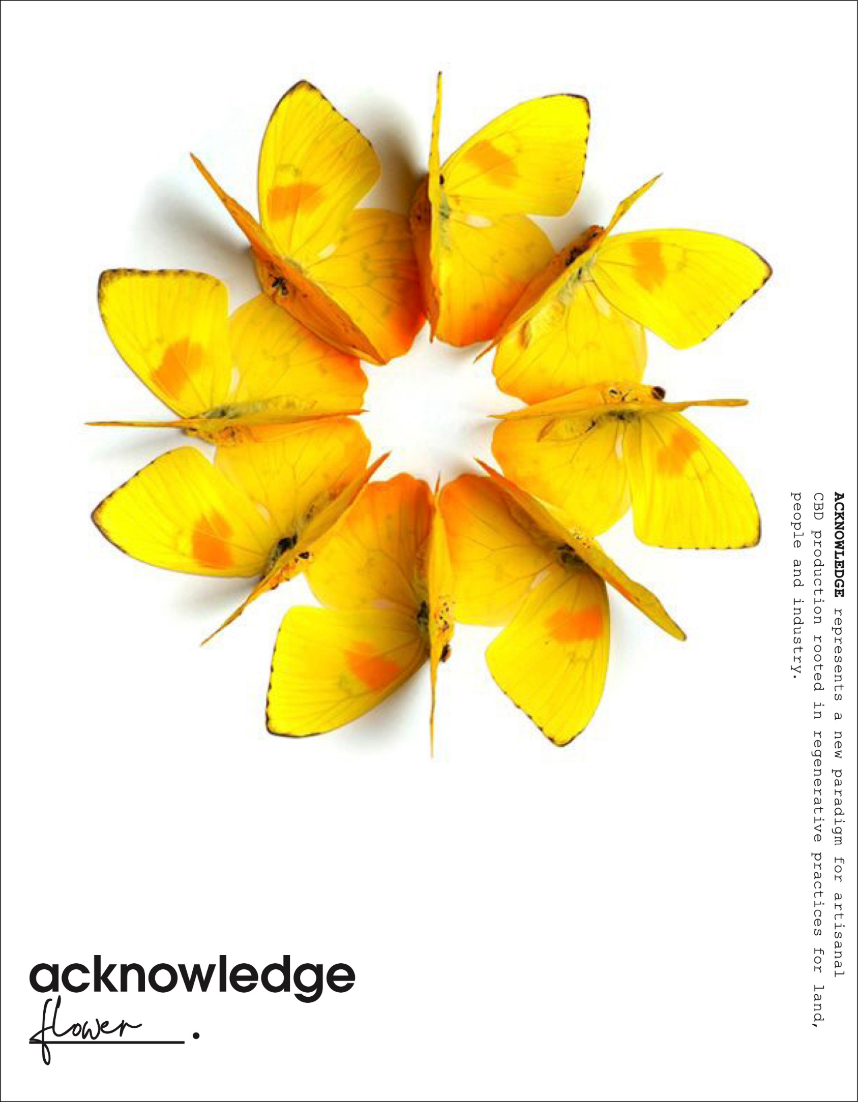
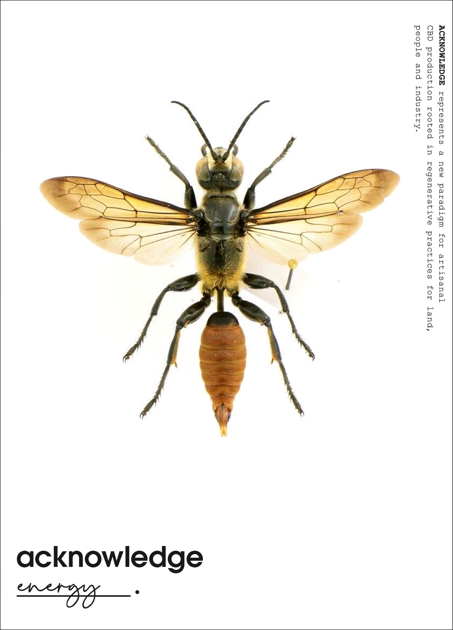
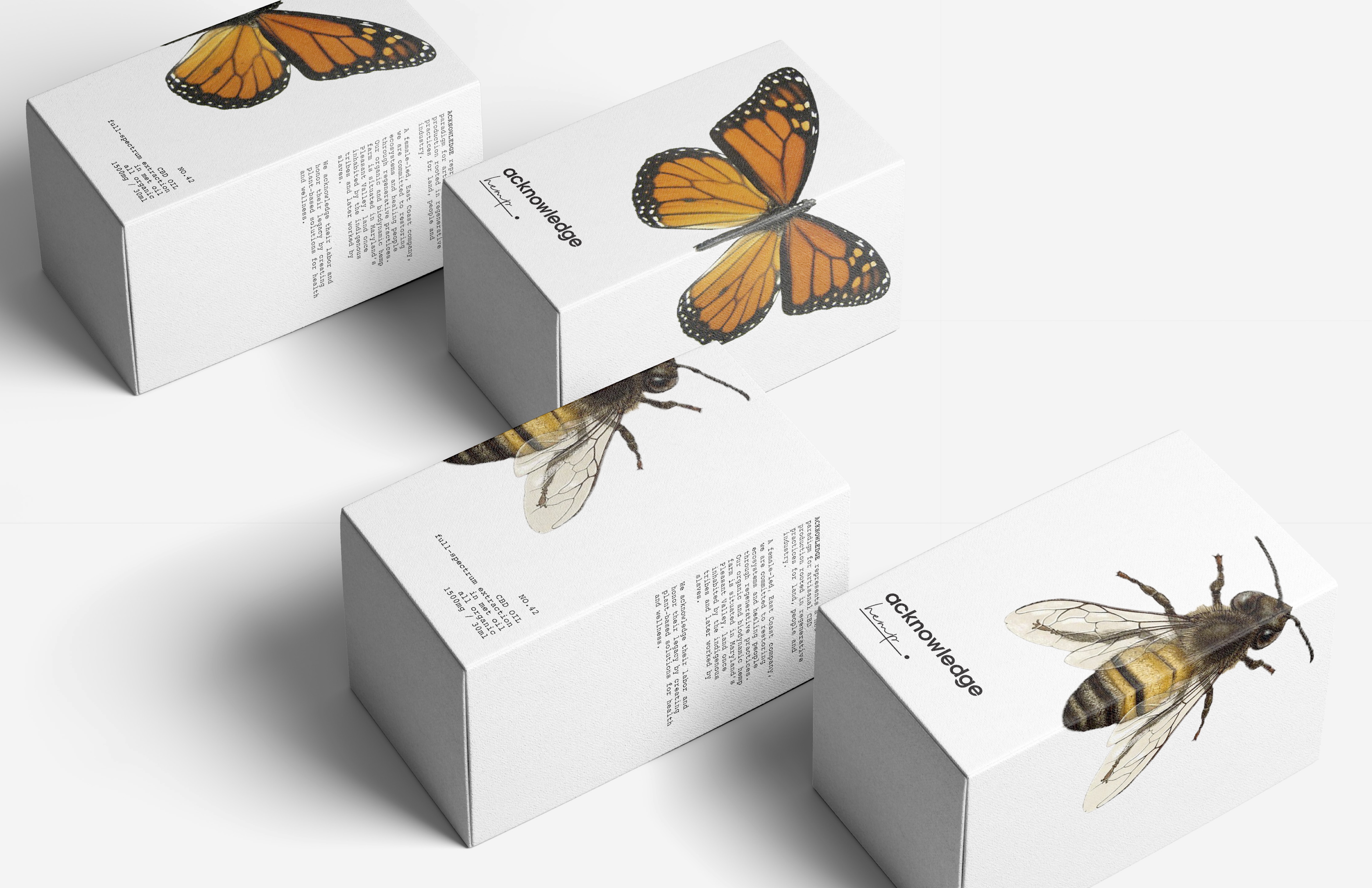
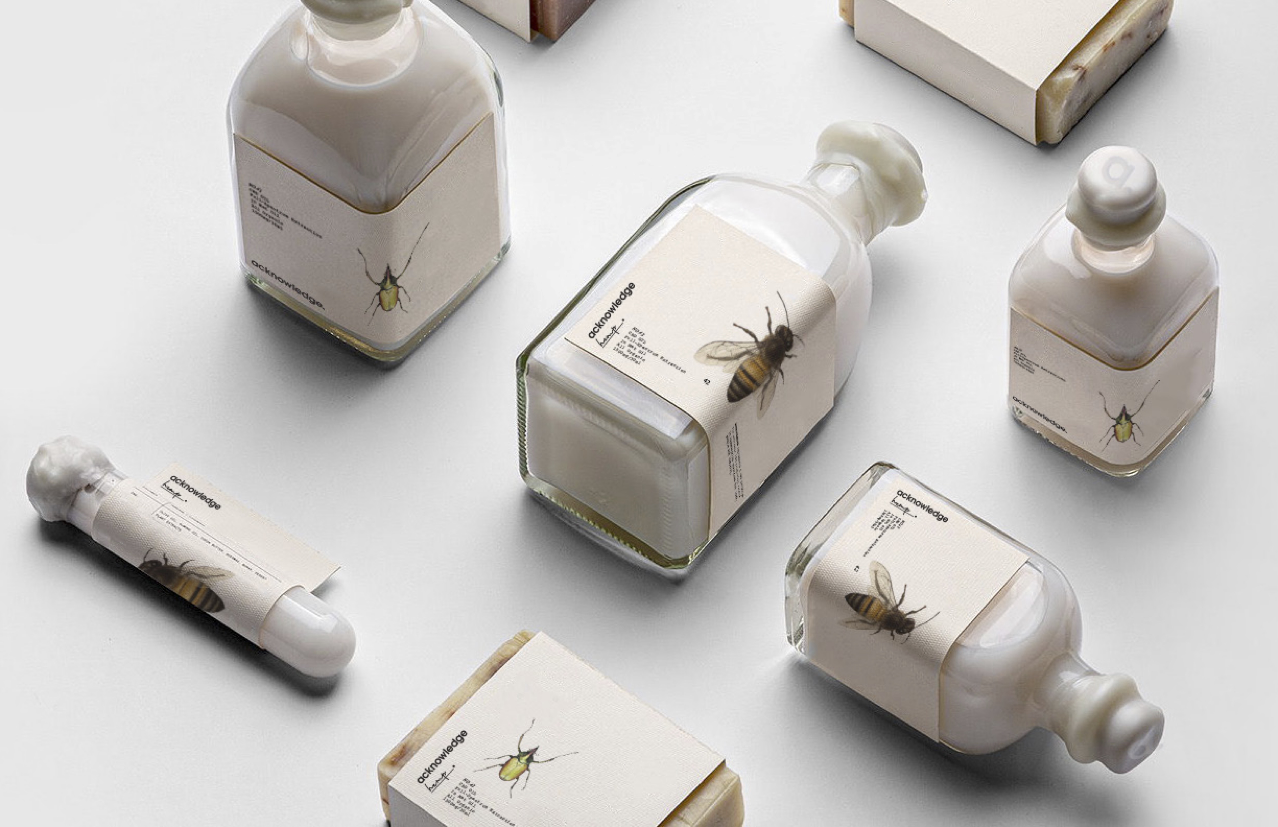
We gave Raven Crest Botanicals a fresh new look—one that lets their lotions, potions, and teas really shine. The plants are the true stars, so we designed a tactile visual language that highlights their beauty and potency.

Tincture bottle with dried herbs and mushroom
Tincture bottle with dried roots
Tincture bottle with dried herbs and fresh flowers
No items found.

Visit the live site → www.ravencrestbotanicals.com

No items found.

(Case 0

4

)

2024

Raven Crest Botanicals

Raven Crest Botanicals

Branding + Ecomm Optimization

About the case

Raven Crest Botanicals is a sanctuary of plant wisdom—a place where herbal alchemy meets deep, ancestral knowing. To honor its essence, we reimagined the brand’s digital presence, weaving together a website that feels lush and intentional.

See the report

Photography had to be grounded in a sense of agency, not pulled by the gravitational weight of an unknown future, but subjects were centered by their confidence, even in the unknown. There is optimism and a touch of whimsy conveyed through color and tonal vibrancy.

We invited images that explore luminosity, shadow, light motion, refraction, lens flare, light leaks, and the depth and layering of an image.

image curation
Graphic Illustration

The graphic system draws on natural phenomena and structural flows. The same systems that reveal when something under the surface is moving or shifting. These visuals echo the tension inherent in emerging AI technologies: potential and uncertainty, disruption and protection.
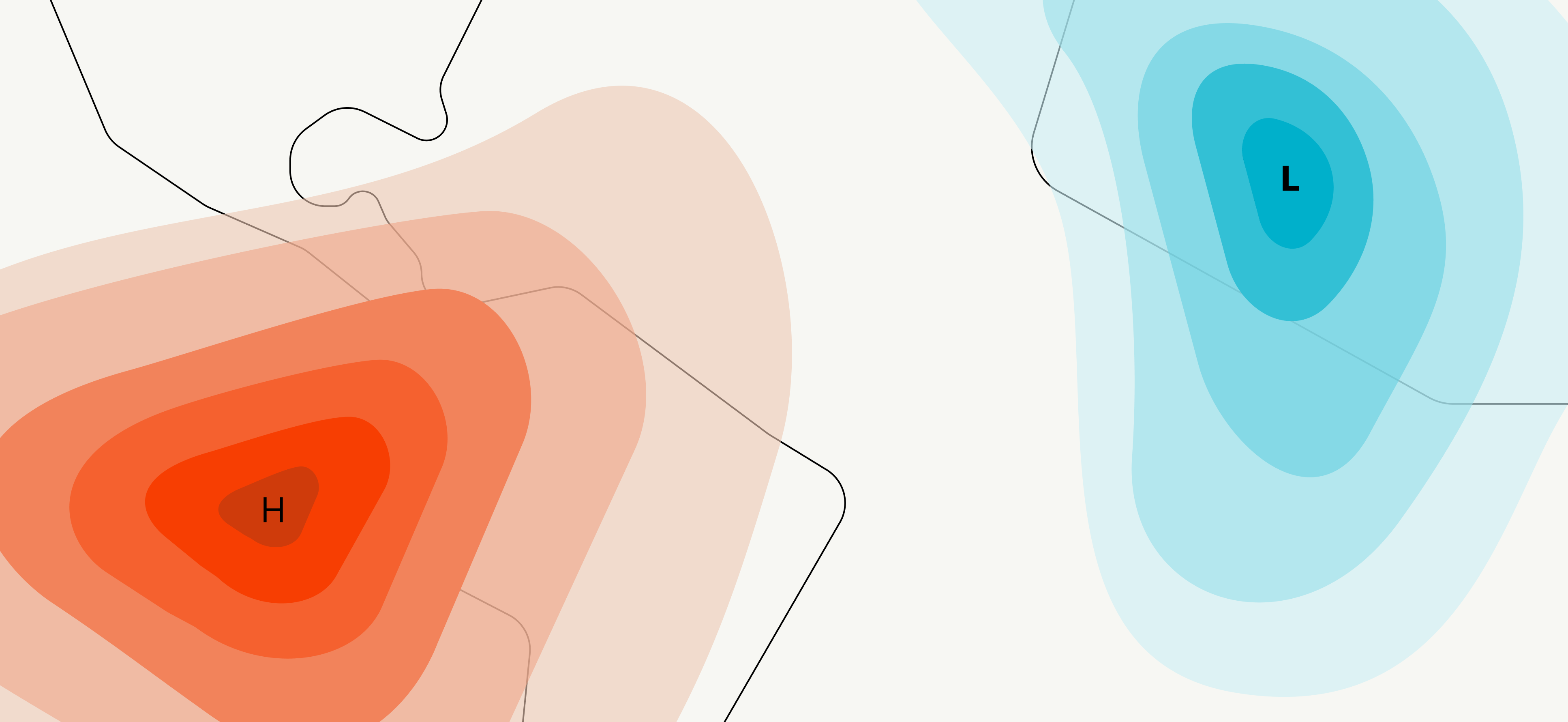

It’s designed to reflect the big picture — the unpredictable nature of change, the fragile balance between power and vulnerability, the collective responsibility we carry in shaping a human-centered future of AI.


Through that lens, every line, shape, and color feels like part of a larger conversation: one about awareness, safety, humanity, and possibility.

The end result is a graphic illustrative system that supports Seismic not just as an organization issuing reports but as a movement advocating informed public engagement, responsible adoption, and proactive guardianship of human integrity in an AI-transformed world.
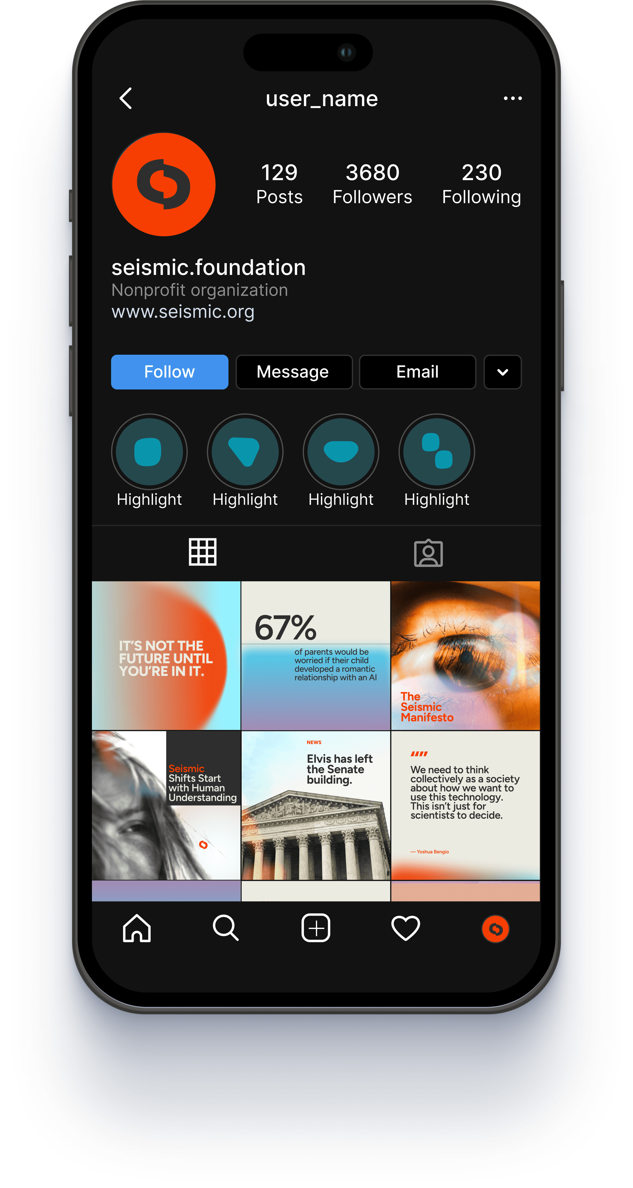

These forms were then woven into the design system across social graphics, banners, and advertising. They serve as subtle cues to the brand and its mission, adding a sense of luminosity and optimism about human agency in an uncertain future.
We transformed a standard Shopify template into a fully customized plant haven. Every element was designed to create a sensory-rich experience where the products and plants take center stage. Intuitive navigation and user flow ensures a smooth, inviting journey from discovery to checkout.

We gave Raven Crest Botanicals a fresh new look—one that lets their lotions, potions, and teas really shine. The plants are the true stars, so we designed a tactile visual language that highlights their beauty and potency.

Visit the live site → www.ravencrestbotanicals.com

No items found.